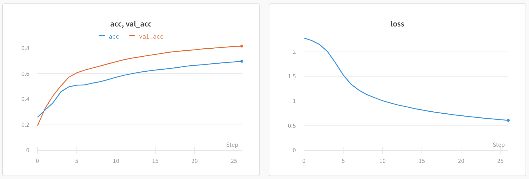
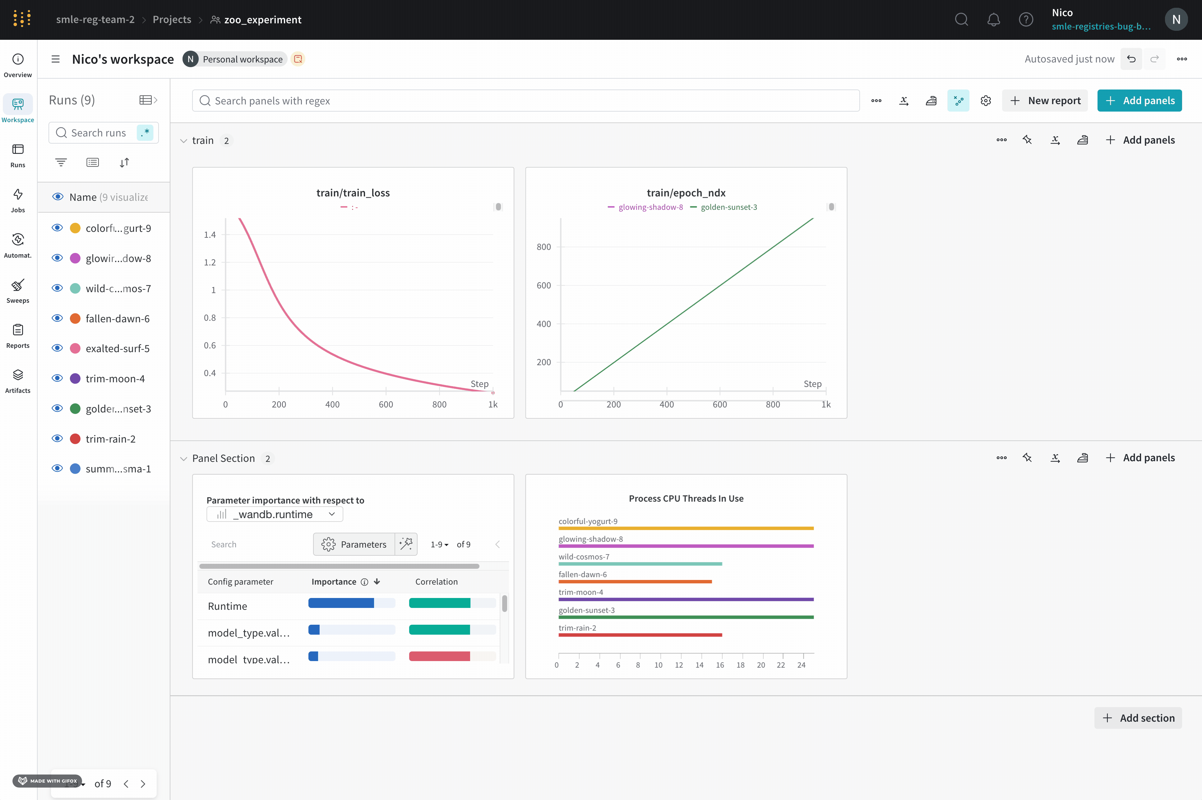
wandb.Run.log() over time. You can customize a line plot to compare multiple lines, calculate custom axes, and rename labels.
Edit line plot settings
This section shows how to edit the settings for an individual line plot panel, all line plot panels in a section, or all line plot panels in a workspace. For comprehensive details about line plot settings, see Line plot reference.Individual line plot
A line plot’s individual settings override the line plot settings for the section or the workspace. To customize a line plot:- Hover your mouse over the panel, then click the gear icon.
- Within the drawer that appears, select a tab to edit its settings.
- Click Apply.
- Data: Configure x-axis, y-axis, sampling method, smoothing, outliers, and chart type.
- Grouping: Configure whether and how to group and aggregate runs in the plot.
- Chart: Specify titles for the panel and axes, and configure legend visibility and position.
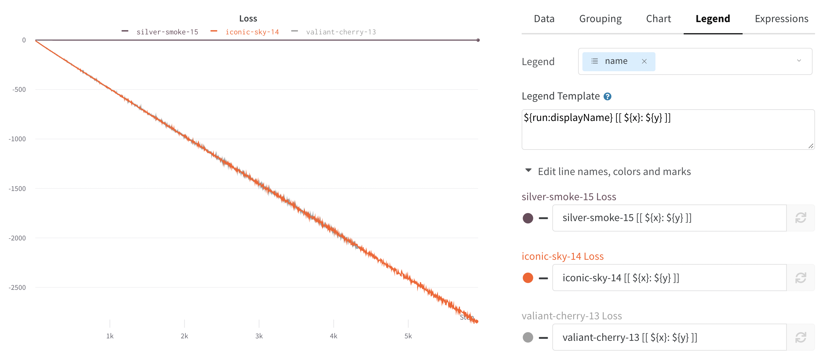
- Legend: Customize the appearance and content of the panel’s legend.
- Expressions: Add custom calculated expressions for the axes.
All line plots in a section
To customize the default settings for all line plots in a section, overriding workspace settings for line plots:- Click the section’s gear icon to open its settings.
- Within the drawer that appears, select the Data or Display preferences tabs to configure the default settings for the section. For details about each Data setting, see the Line plot reference. For details about each display preference, refer to Configure section layout.
All line plots in a workspace
To customize the default settings for all line plots in a workspace:- Click the workspace’s settings, which has a gear with the label Settings.
- Click Line plots.
- Within the drawer that appears, select the Data or Display preferences tabs to configure the default settings for the workspace.
- For details about each Data setting, see the Line plot reference.
- For details about each Display preferences section, refer to Workspace display preferences. At the workspace level, you can configure the default Zooming behavior for line plots. This setting controls whether to synchronize zooming across line plots with a matching x-axis key. Disabled by default.
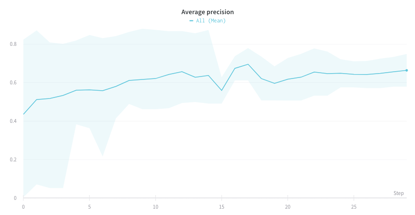
Visualize average values on a plot
If you have several different experiments and you’d like to see the average of their values on a plot, you can use the Grouping feature in the table. Click “Group” above the run table and select “All” to show averaged values in your graphs. Here is what the graph looks like before averaging: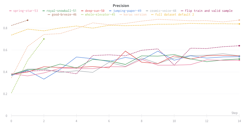
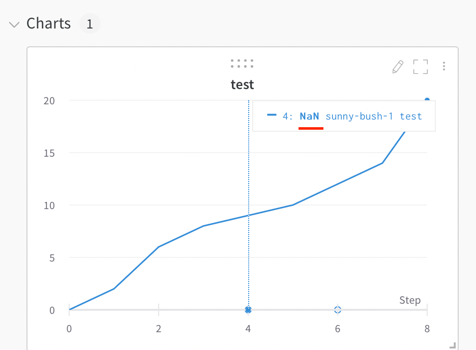
Visualize NaN value on a plot
You can also plotNaN values including PyTorch tensors on a line plot with wandb.Run.log(). For example:
Compare multiple metrics on one chart
- Select the Add panels button in the top right corner of the page.
- From the left panel that appears, expand the Evaluation dropdown.
- Select Run comparer
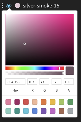
Change the color of the line plots
Sometimes the default color of runs is not helpful for comparison. To help overcome this, wandb provides two instances with which one can manually change the colors.- From the run table
- From the chart legend settings
Each run is given a random color by default upon initialization.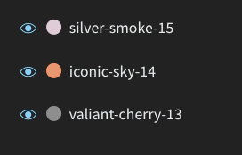
Visualize on different x axes
If you’d like to see the absolute time that an experiment has taken, or see what day an experiment ran, you can switch the x axis. Here’s an example of switching from steps to relative time and then to wall time.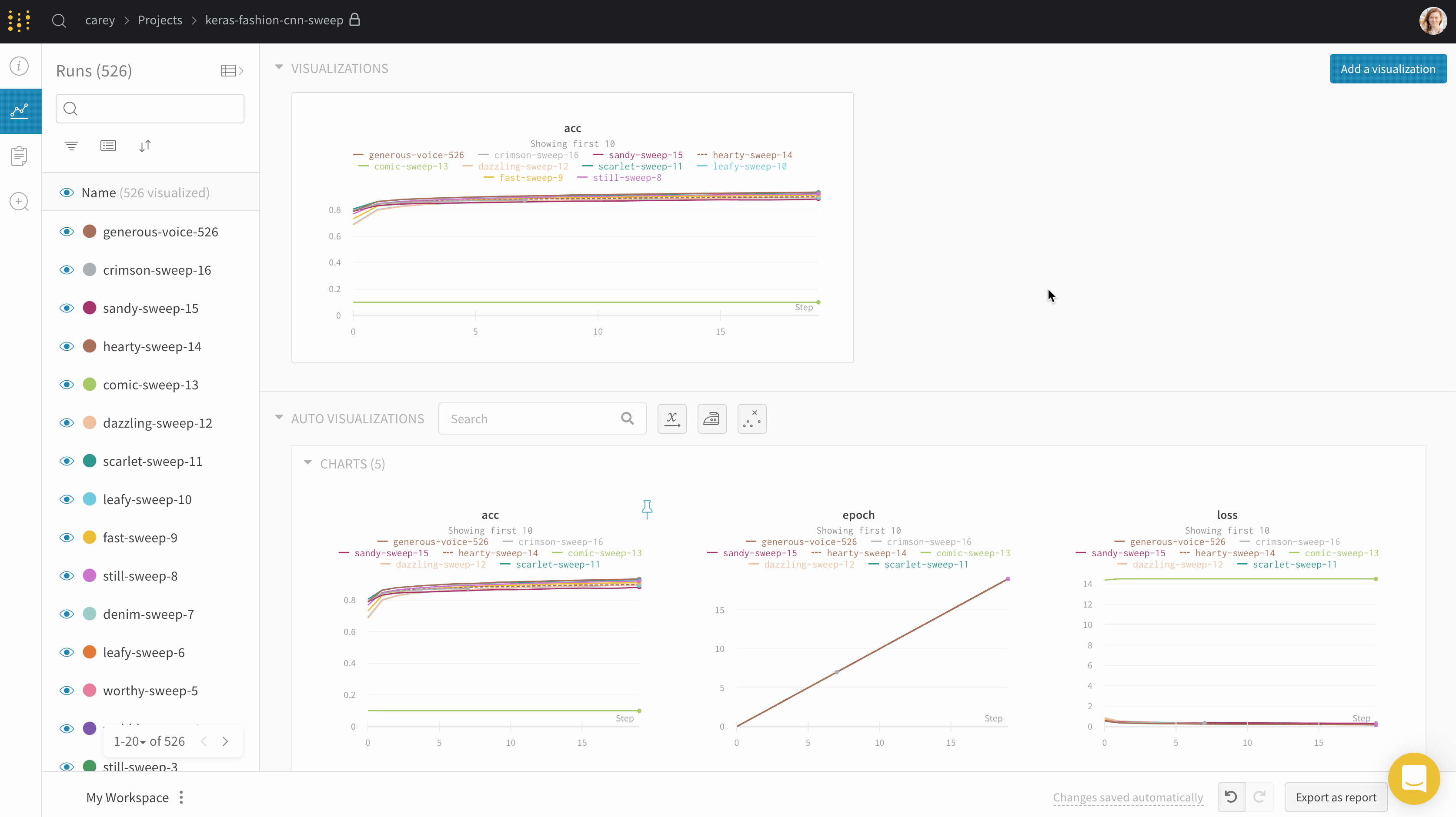
wandb.Run.log() where you log the y-axis.
Zoom
Click and drag a rectangle to zoom vertically and horizontally at the same time. This changes the x-axis and y-axis zoom.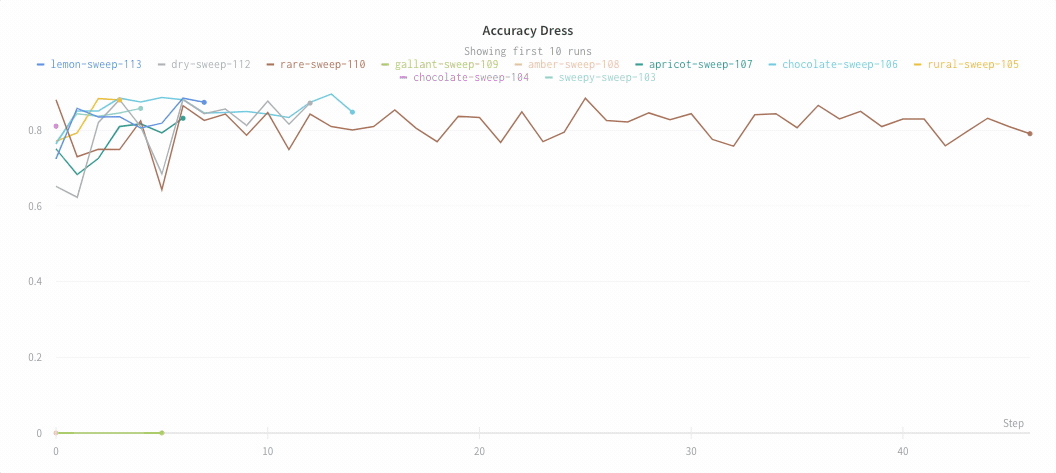
Hide chart legend
Turn off the legend in the line plot with this simple toggle:
Create a run metrics notification
Use Automations to notify your team when a run metric meets a condition you specify. An automation can post to a Slack channel or run a webhook. From a line plot, you can quickly create a run metrics notification for the metric it shows:- Hover over the panel, then click the bell icon.
- Configure the automation using the basic or advanced configuration controls. For example, apply a run filter to limit the scope of the automation, or configure an absolute threshold.