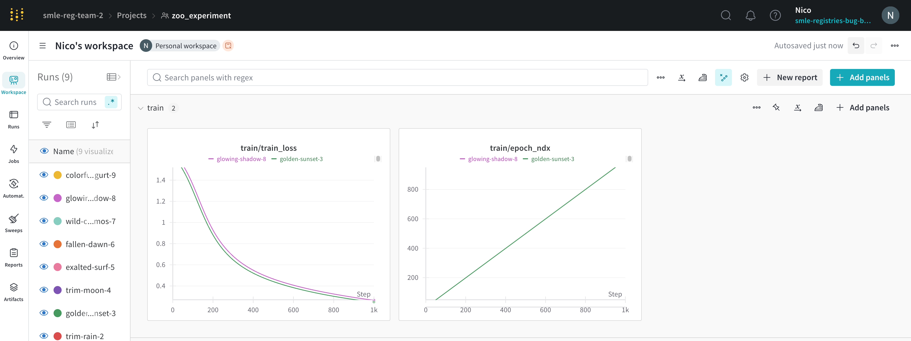
Data settings
X-axis
wandb.Run.log() as a number.
Available time-based x-axis options:
- Step: Increments each time
wandb.Run.log()is called. Reflects the number of training steps logged from your model. (Default) - Relative Time (Wall): Clock time since the process started. If you start a run, pause it for a day, then resume and log, that point appears at 24 hours.
- Relative Time (Process): Time inside the running process. If you start a run, run for 10 seconds, pause for a day, then resume, that point appears at 10 seconds.
- Wall Time: Minutes elapsed since the start of the first run on the graph.
- X range: From the smallest to largest value of your x-axis by default. You can customize the minimum and maximum values.
Y-axis
Set the y-axis variables to any value logged withwandb.Run.log() as a number, array of numbers, or histogram of numbers. If you logged more than 1500 points for a variable, W&B samples down to 1500 points.
Customize the color of your y-axis lines by changing the run color in the runs table.
- Y range: Default is from the smallest positive value of your metrics (inclusive of 0) to the largest value of your metrics. You can customize the minimum and maximum values.
Point aggregation method
Choose the sampling mode for displaying data points:- Random sampling (default): See Random sampling.
- Full fidelity: See Full fidelity.
Smoothing
Set the smoothing coefficient between 0 and 1, where 0 is no smoothing and 1 is maximum smoothing. Available smoothing methods:- Time weighted EMA (default): a technique for smoothing time series data by exponentially decaying the weight of previous points.
- Running average: replaces a point with the average of points in a window before and after the given x value.
- Gaussian: computes a weighted average of the points, where the weights correspond to a gaussian distribution with the standard deviation specified as the smoothing parameter.
- No smoothing
Ignore outliers
Rescale the plot to exclude outliers from the default plot min and max scale. The setting’s impact depends on the plot’s sampling mode:- Random sampling mode: Ignoring outliers omits points below 5% and above 95% from the plot.
- Full fidelity mode: Ignoring outliers shows all points, condensed down to the last value in each bucket, and shades the area below 5% and above 95%.
Max runs or groups
By default, plots include only the first 10 runs or groups of runs in the run list or run set. Change the sort order to control which runs or groups to display.A workspace is limited to displaying a maximum of 1000 runs, regardless of its configuration.
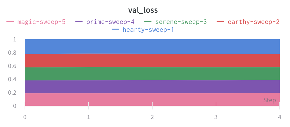
Chart type
Choose the plot style:- Line plot

- Area plot
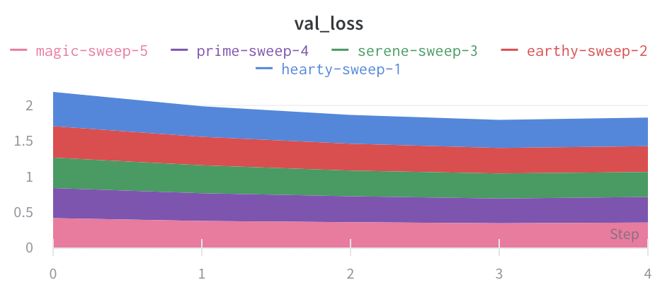
- Percentage area plot:
Grouping settings
Aggregate all runs by turning on grouping, or group over an individual variable. When you turn on grouping in the runs table, the groups automatically populate into the graph.- Group by: Select a column. All runs with the same value in that column are grouped together.
- Aggregation: The value of the line on the graph. Options are mean, median, min, and max of the group.
Chart settings
Configure titles and legend visibility:- Panel title: Title displayed at the top of the panel.
- X-axis title: Label for the x-axis.
- Y-axis title: Label for the y-axis.
- Legend: Show or hide the legend, and configure its position.
Legend settings
Customize the legend to show any config value logged and metadata from the runs, such as creation time or the user who created the run.Legend template
Define a template for the legend name. Example:${run:displayName} - ${config:dropout} produces a legend name like royal-sweep - 0.5, where royal-sweep is the run name and 0.5 is the config parameter named dropout.
Point-specific values
Set values inside[[ ]] to display point-specific values in the crosshair when hovering over a chart.
Example: [[ $x: $y ($original) ]] displays something like “2: 3 (2.9)”
Supported values inside [[ ]]:
| Value | Meaning |
|---|---|
${x} | X value |
${y} | Y value (including smoothing adjustment) |
${original} | Y value not including smoothing adjustment |
${mean} | Mean of grouped runs |
${stddev} | Standard deviation of grouped runs |
${min} | Min of grouped runs |
${max} | Max of grouped runs |
${percent} | Percent of total (for stacked area charts) |
Expressions
Add custom calculated expressions to create derived metrics.Y-axis expressions
Plot values derived from metrics. For example, calculate1-accuracy or other arithmetic expressions. Currently only works when plotting a single metric.
Supported operators: +, -, *, /, %, and ** (for exponents).
You can calculate custom lines using both logged metrics and configuration values like hyperparameters.
X-axis expressions
Rescale the x-axis using calculated values with custom expressions. Useful variables:_step: The default x-axis value.${summary:value}: Reference summary values.